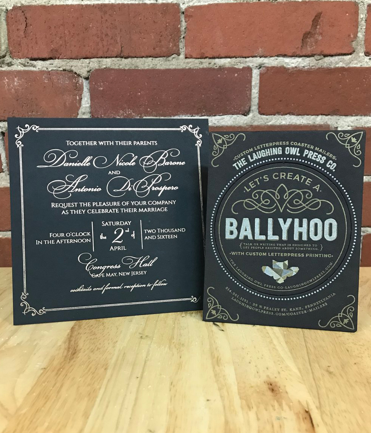
Metallic Foil vs. Metallic Ink
Looking for an ink that's snazzy? Let us break down the differences between metallic foil and metallic ink.
Letterpress is much more than creating an image on paper, it’s all about connecting with people through the use of texture, color, and the embrace of imperfection. Much like the way a musician connects with people using tone, pitch, and that seemingly magic touch that separates the greats from the masses, the embrace, and exploitation of imperfection. Just like how a musician will use different instruments and equipment to get a different tone, printers can use not only different colors but different types of ink and foil to create different effects. Foils and metallic inks are two great ways to add a new element to a letterpress work. They help make a design pop out and stand apart from the norm.
While foil and metallic ink are very similar to each other, they are also very different and have different strengths. Just like James Taylor and Jimi Hendrix, they both sing, play guitar, write songs, and are both named James. However, they are also very different. Just listen to “Fire and Rain” by Taylor and “Fire” by Hendrix. The difference between foil and metallic ink is that foil is just that, a metallic foil, where metallic ink is ink with metal particles mixed into the ink. There is no ink involved in foil stamping, for more info on that check out our previous blog post “Foil Stamping, The Good, The Bad, & The Shiny.” Metallic ink on the other hand is an ink and is treated just like any other ink when it comes to printing.
When deciding between foil and metallic ink, there are a few factors that come into play. The three main factors are how much the design needs to grab attention, coverage, and cost. Both metallic inks and foils are good for standing out on a print, but catching and reflecting light is what foil does best. If you need something to be bold without being drastically different, metallic ink is the way to go. Just like if you were sitting in a small coffee shop reading a blog about letterpress, a James Taylor song playing in the background would be a good fit. Not so much if you were speeding down the highway with the windows down and the stereo cranked, Hendrix would be the better choice here. Both have their strengths depending on the situation and what the goal for the print is.
Getting back to the embrace of imperfection, or the happy little accidents that make each piece of letterpress unique. With metallic inks, you can mess around with over-inking, under inking, or any other method of altering the coverage. This is not something you can do with foil. With foil, it’s all or nothing and usually, the edges of the design are very pristine. In this particular case, Mr. Taylor is the foil and Hendrix is the ink, the foil is uniform and consistent, whereas with ink you never truly know what you’re going to get. Both have their benefits and are subjective to what is needed for the project.
Cost is another factor in determining whether foil or metallic ink is going to be used. Printing with ink is more cost-effective than foil, due to the fact that foil requires its own special process. Metallic ink can be put on the rollers of any machine just like any other ink. No special plates or process means a lower cost. Keep in mind though, that metallic inks do have a bit of a sheen to them, just not nearly the amount of a foil. So if you have a budget to stick to, metallic ink may be the best bet, but if cost is less of a factor and you really want that eye-catching pop, foil is the way to go.
All in all, both metallic ink and foil are great alternatives to normal inks, adding contrast and standing out from the normal. The main idea here is to remember that as similar as the two seem there is a difference between them. Foil is full coverage and very reflective, metallic ink is an ink, less reflective, and more cost-effective. Just like “Fire and Rain,” and “Fire,” both are great, but appropriate for different situations.