
Tech & Specs
Welcome to the world of letterpress—where the press and process control what you can do with your design!
File Requirements
Our favorite program for artwork creation is Adobe Illustrator. In house, we use Adobe CC and prefer .ai, .pdf (editable), or .eps vector files.
File Preparation
- If available, begin with one of our layout templates. Our templates already have the appropriate color book and layout layers preset.
- Place each piece/side on its own artboard. We do not require a separate file for each side or piece.
- Color separate your artwork and place each color on its own layer. Overlapping colors will be printed as such. Letterpress inks are semi-transparent and overlapping colors will create a new color at the overlap.
- Specify colors from the Pantone Solid Uncoated color book, no CMYK. It is best practice to choose colors from a physical Pantone guide as monitors will not accurately render all colors. We will color-match to a Pantone guide at the press.
- Make sure all artwork is in vector format with no embedded images (use “Live Trace” if needed).
- It is best practice to keep line weights above .25pt. Watch text bodies and serifs.
- Use appropriate tools from the Pathfinder toolbar for vector creation.
- Outline all text (“Type->Create Outlines”).
- Outline all Strokes (“Object->Path->Outline Stroke”).
- Save the file as a .ai, editable .pdf, or .eps with a unique name for easy identification (such as “Jane Smith Invitations.ai” NOT “wedding invitations.ai”)
There’s a Solution
It might seem a little intimidating at times, but keep in mind that letterpress has been around for hundreds of years, so all of the hard stuff has already been figured out. These tips are our general rules of thumb that will help to answer the question of “is there anything I should keep in mind when submitting artwork?” If you still have questions about whether or not your artwork is suitable for letterpress, send it over to us at hello@laughingowlpress.com and we’ll review it.
Don’t Be Shady
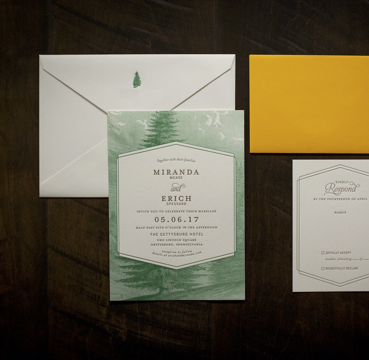
When designing for letterpress think solid colors. If we tried from now to eternity we would not be able to print shadows or gradients. It’s the nature of letterpress. If your artwork calls for shading, try using cross-hatched lines or dots to give the effect. If you are feeling ambitious and would like to use a halftone, our plates can hold 100 LPI (lines per inch).
One Color At A Time
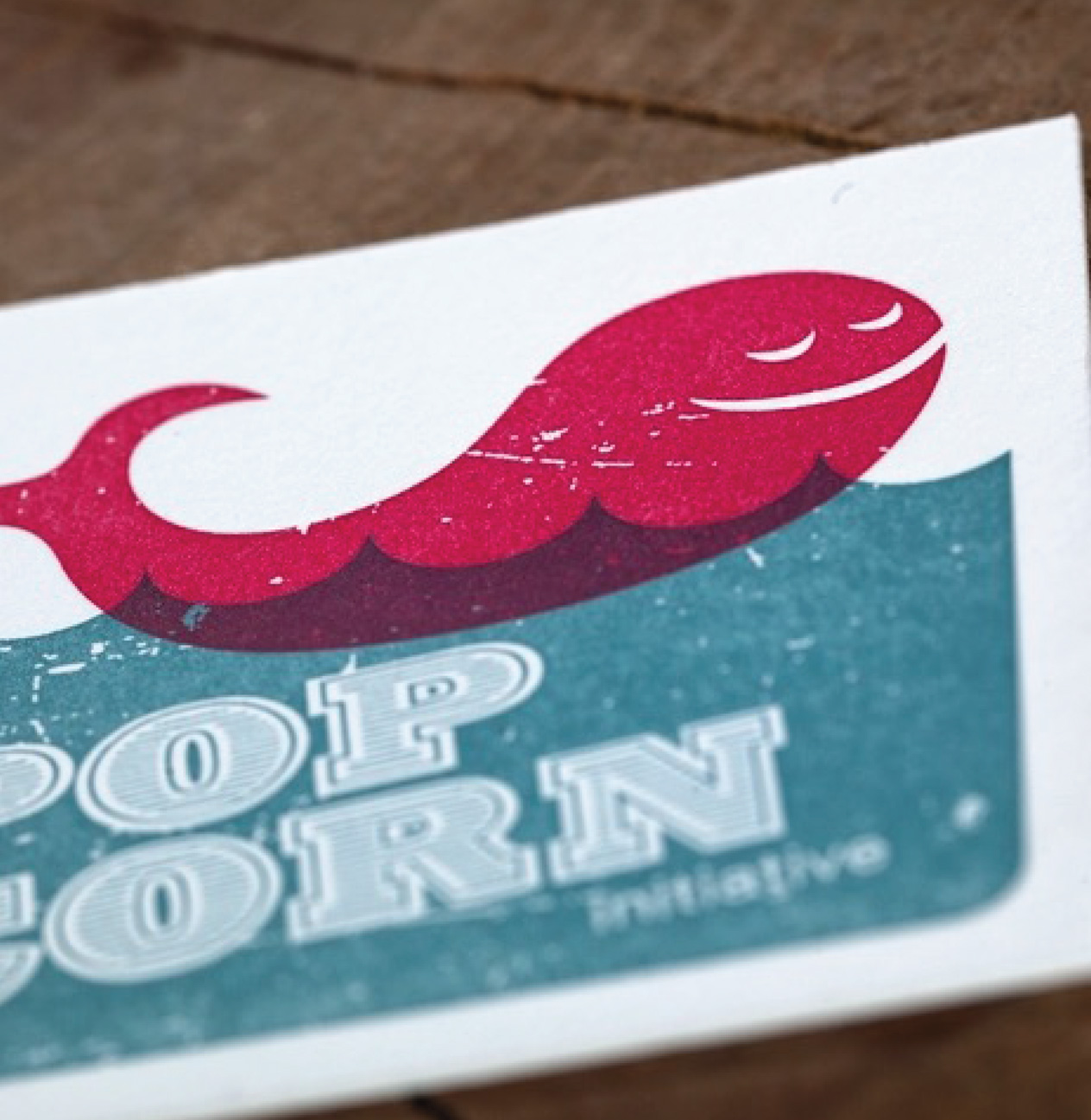
Every color in your design will require a separate printing plate, set up, and will get its own run through the press. It’s just one of those facts of letterpress printing. This is why with each additional color, the price increases. This is also why crop marks on your artwork are helpful to align the colors during printing. There are some creative ways of creating a third (or more) color. Because letterpress ink is transparent by nature, overlapping two colors to create a third color is a technique often used with great results.
Trapping
Trapping is a term used to describe the compensation for misregistration between colors that should have hairline registration (when two colors are accurately aligned to be touching). When you are feeding paper by hand into an antique press it is very difficult to achieve hairline registration. For this reason, we ask that you trap any colors by at least .375 pt that should have hairline registration. This gives us a little bit of wiggle room and ensures that there will be no gaps between two colors that should be touching.

Artwork that looks like this...
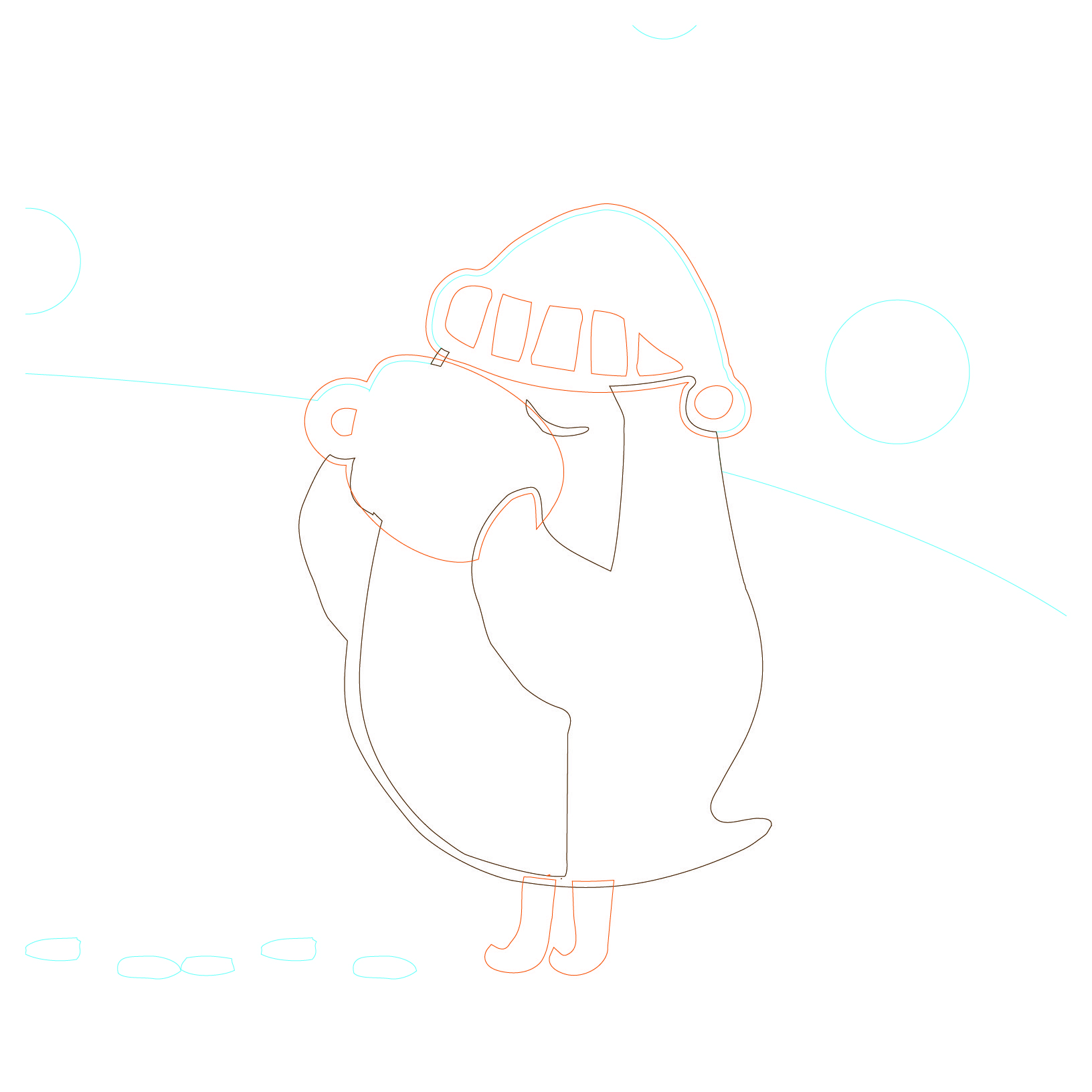
...should be trapped like this...
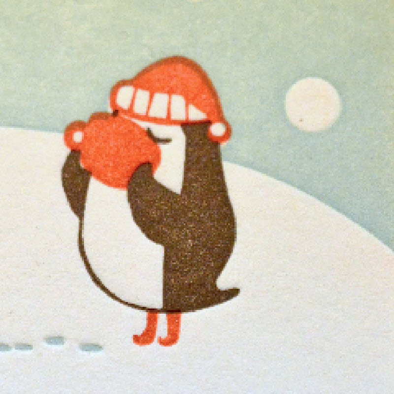
…and will look like this when printed.
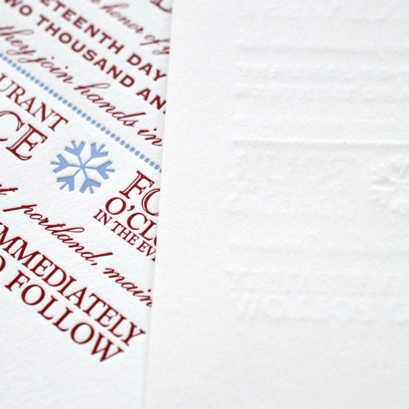
For two-sided projects, use a thick paper stock such as our double-thick cotton or consider duplexing.
Two-Sided Printing
There are some restrictions when it comes to two-sided letterpress printing. We typically recommend using only heavier-weight papers (such as our 220lb Lettra stock) when printing both sides because of the deep impression that is the hallmark of modern letterpress printing. Alternatively, we most often advise duplexing the project (more on that below). When printing on a thinner paper (such as our 110 Lettra stock) the impression on the front of the print will show through on the back.
We rarely duplex two-sided coasters. Keep in mind that when printing both sides, the second side printed tends to compress the first side. We will always print the front side last to allow for the deepest and most crisp impression.
Flood Warning
Letterpress printing is not ideal for printing large solid floods of color. This is due to several factors including the transparent nature of letterpress inks, paper texture, and the amount of ink that is able to be transferred before filling in negative areas or causing ink spread. This is not to say that we never print large coverage areas, but the print will tend to look suede-like or slightly faded, especially with darker ink colors on white paper. There also tends to be variation in ink coverage over the course of a print run and large solid color floods accentuate this. Most clients feel this adds character to the project and highlights the hand printed and vintage nature of letterpress.
Another thing to keep in mind when printing large floods of color is that overall the printing impression in the paper will be much less. This is because there is more surface area on the printing plate, and the press has to work that much harder to press the plate into the paper. Lastly, if a flood of color is being printed along with more delicate lines or text, a separate run through the press may be required and would be priced as another color.
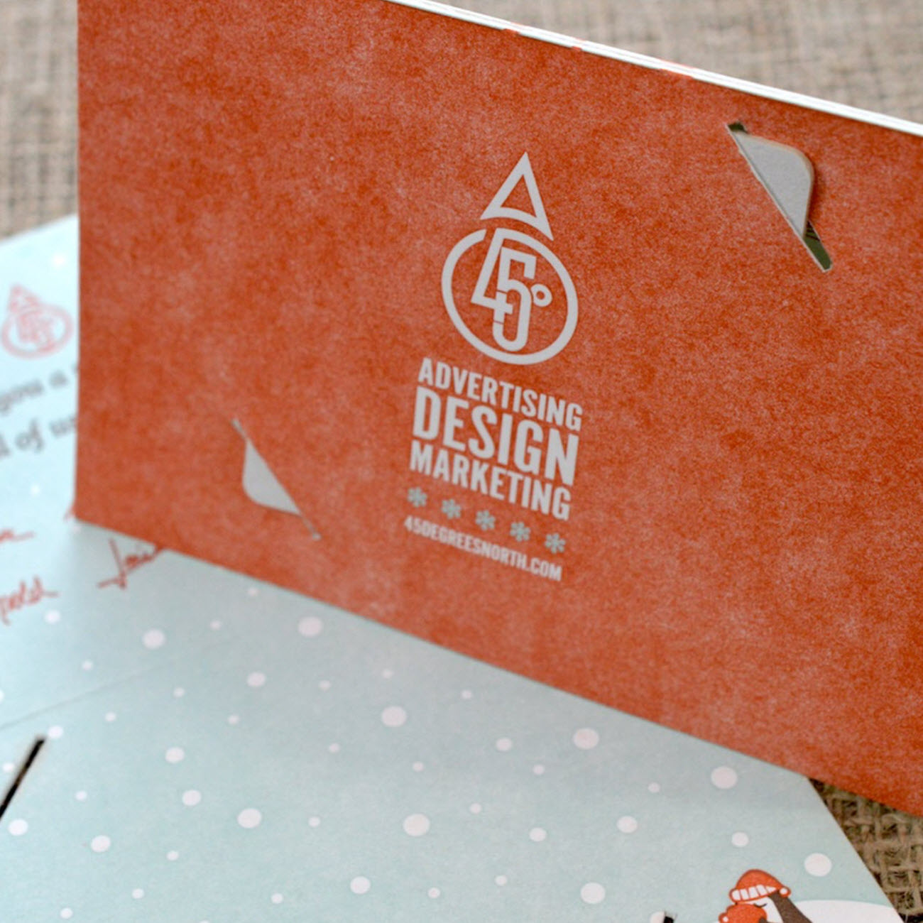
If large color floods are used, be prepared for the possibility of an uneven appearance.
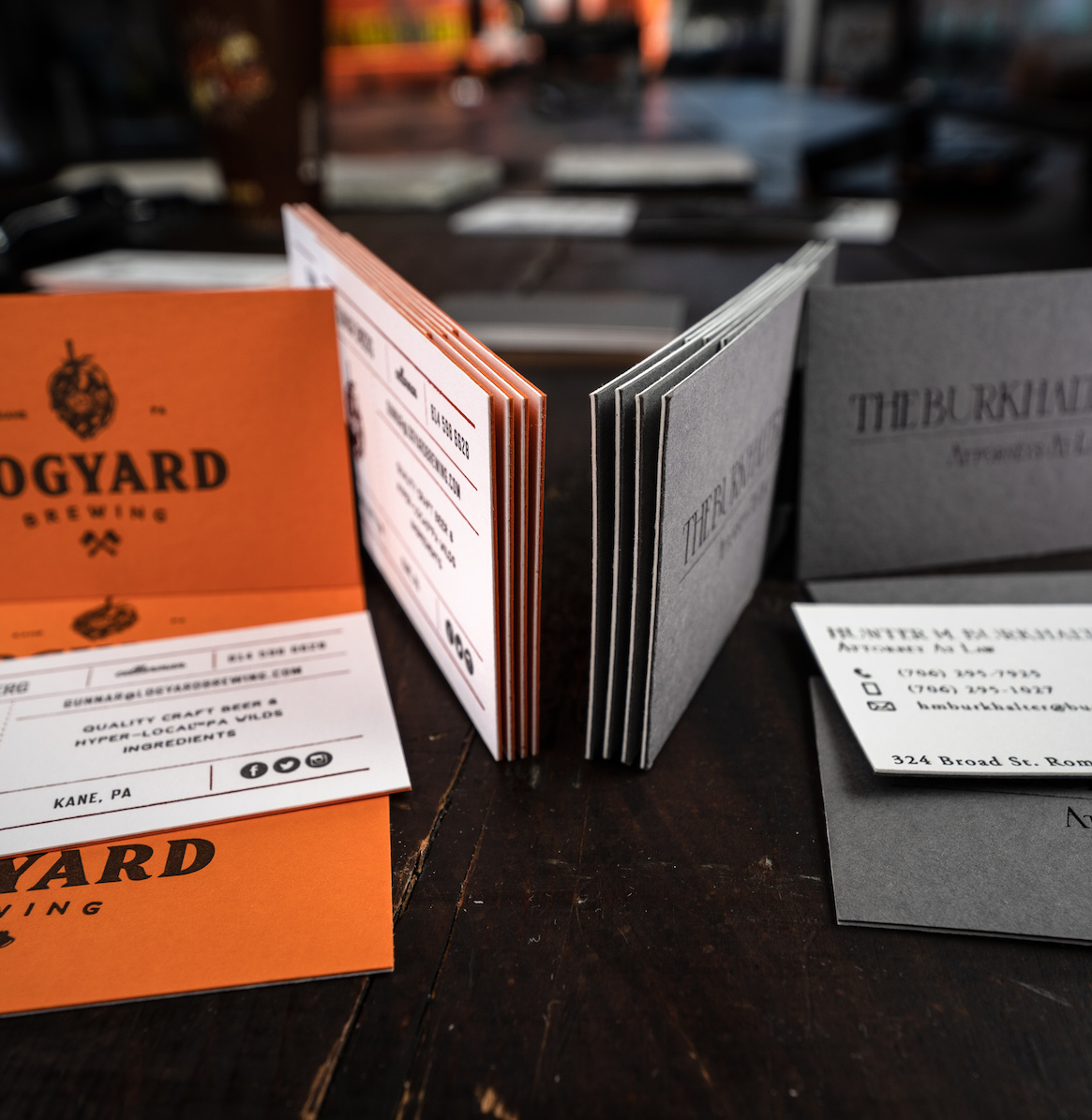
Use colored paper in place of an inked color flood. It adds weight and interest!
Perplexing 'Plexing
We almost always recommend duplexed paper for two-sided printing to allow for the deepest impression possible on both sides. We also recommend duplexing when a full bleed color flood is desired for one or both sides vs. letterpress printing a flood color (see flood warning above)? It’s a pretty handy way to add a pop of color or create a more substantial thickness. If two pieces of paper just aren’t enough, why not throw a third in? Triplexed business cards with colored paper sandwiched in the middle are second to none. We can duplex or triplex virtually any type of paper for endless possibilities of weight and color combinations.
Ink Vs. Foil
It’s shiny, it’s luxurious, it’s….foil! Sometimes foil printing is necessary for a project, such as when the design calls for light colors on dark paper. We’ll let you know when this is the case. We can print metallic inks on dark or light paper with great results, but they will not have that trademark shine. Other times, a beautifully foil-printed project just has a certain….we don’t know what, that sets it apart. Dare we say it’s the champagne of printing?
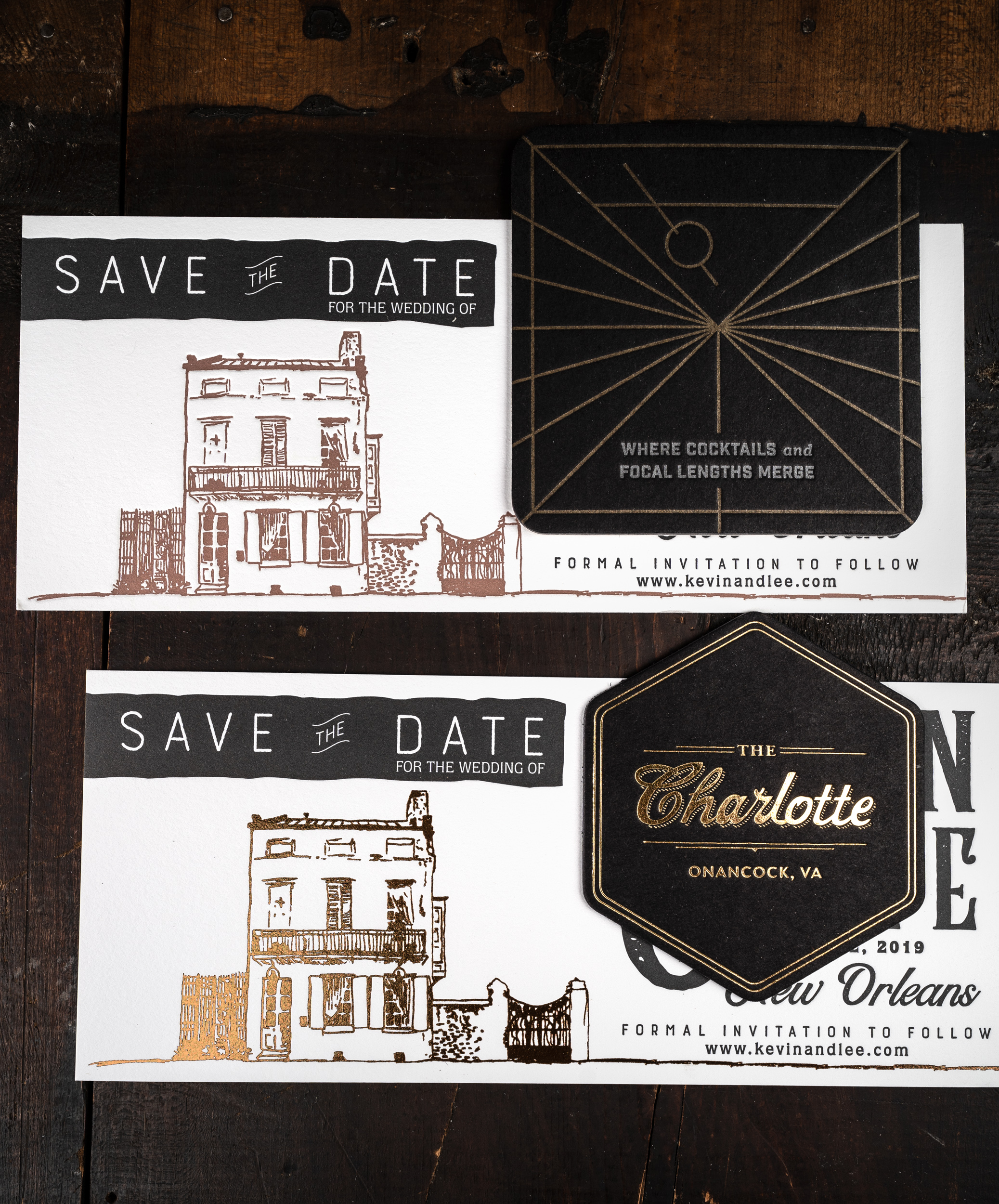
Foil will pop on dark colored papers, and add a fancy factor.
Handmade Paper & Deckled Paper
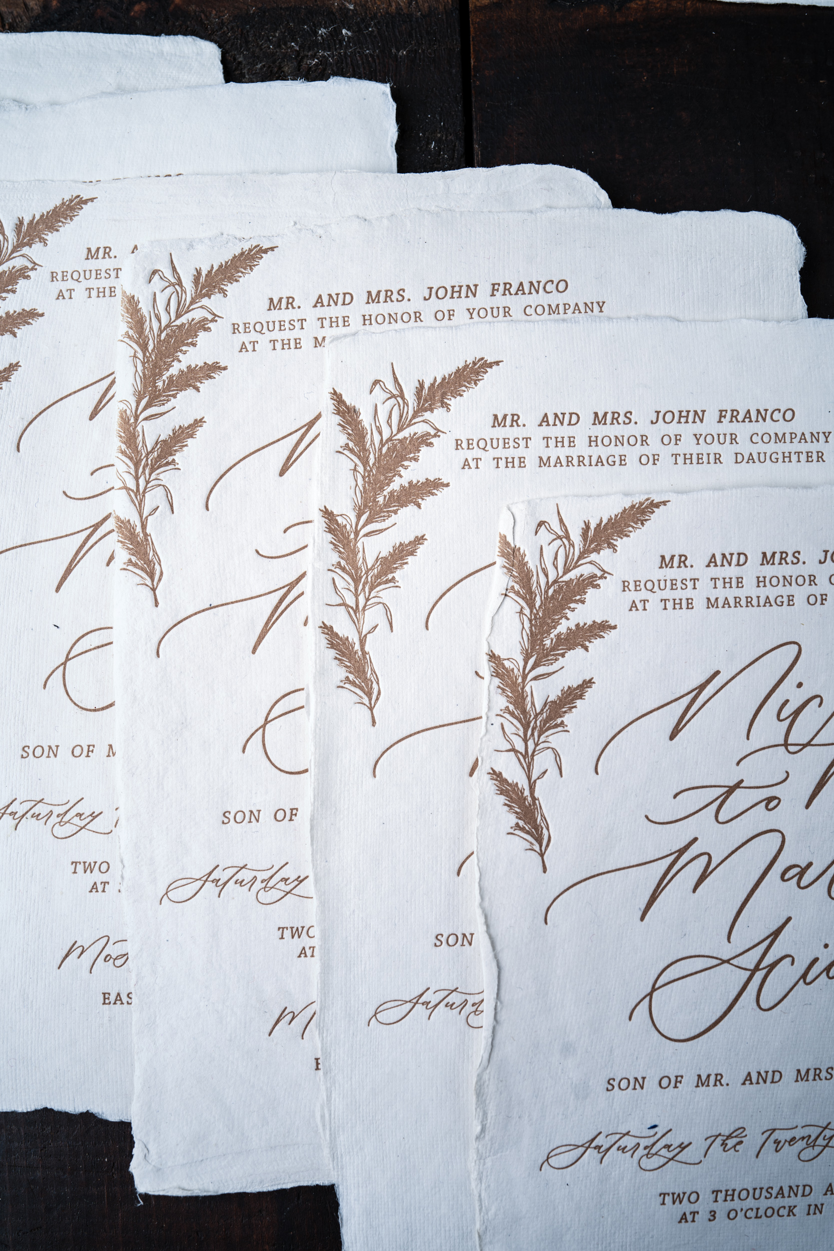
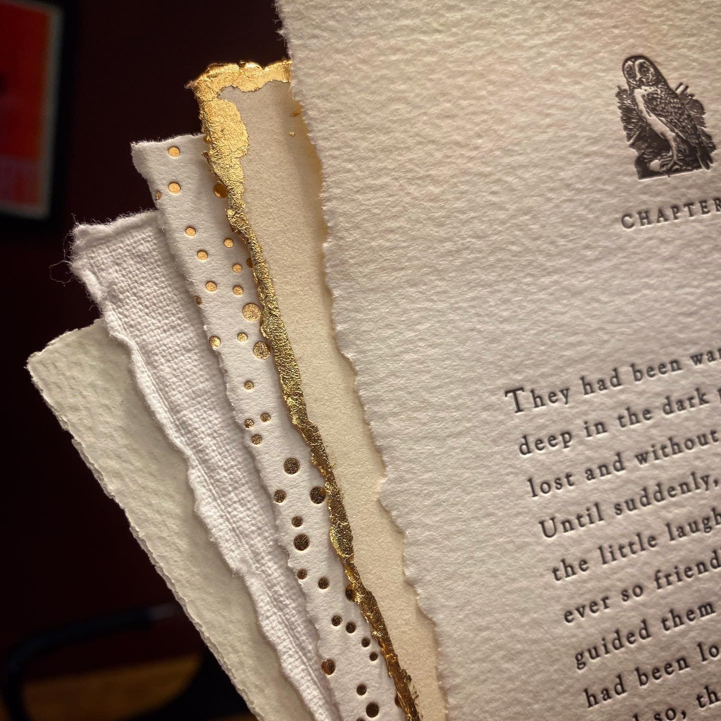
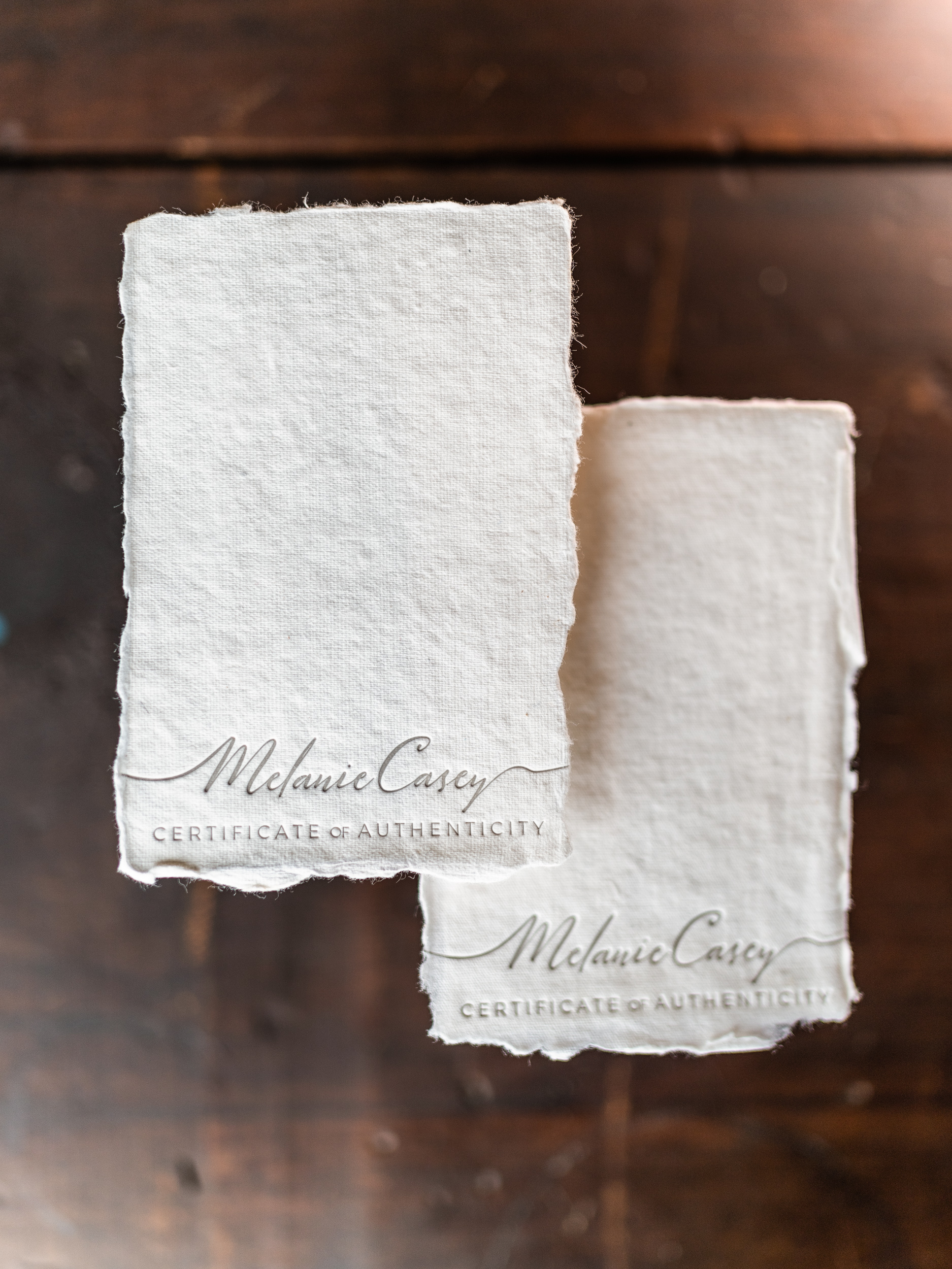
Like falling in love, you’ll know it when you feel it. Handmade paper can add an extremely bespoke touch to a project, and the combination of the two age-old crafts of papermaking + letterpress is nearly indescribable. There are some limitations to keep in mind. No two pieces of handmade paper are the same. This means that tight registration of colors or tight margins should be avoided. Be prepared for each piece to be unique, with varying registration and impression depth.
A great middle-of-the-road option is deckled edge paper. This is machine-made paper with torn edges. It’s much more uniform and easier to pull off multiple colors with a more consistent registration. Depending on the design, we may need to hand-deckle the paper right here in our shop to make sure your project is exactly right.
Envelope Printing
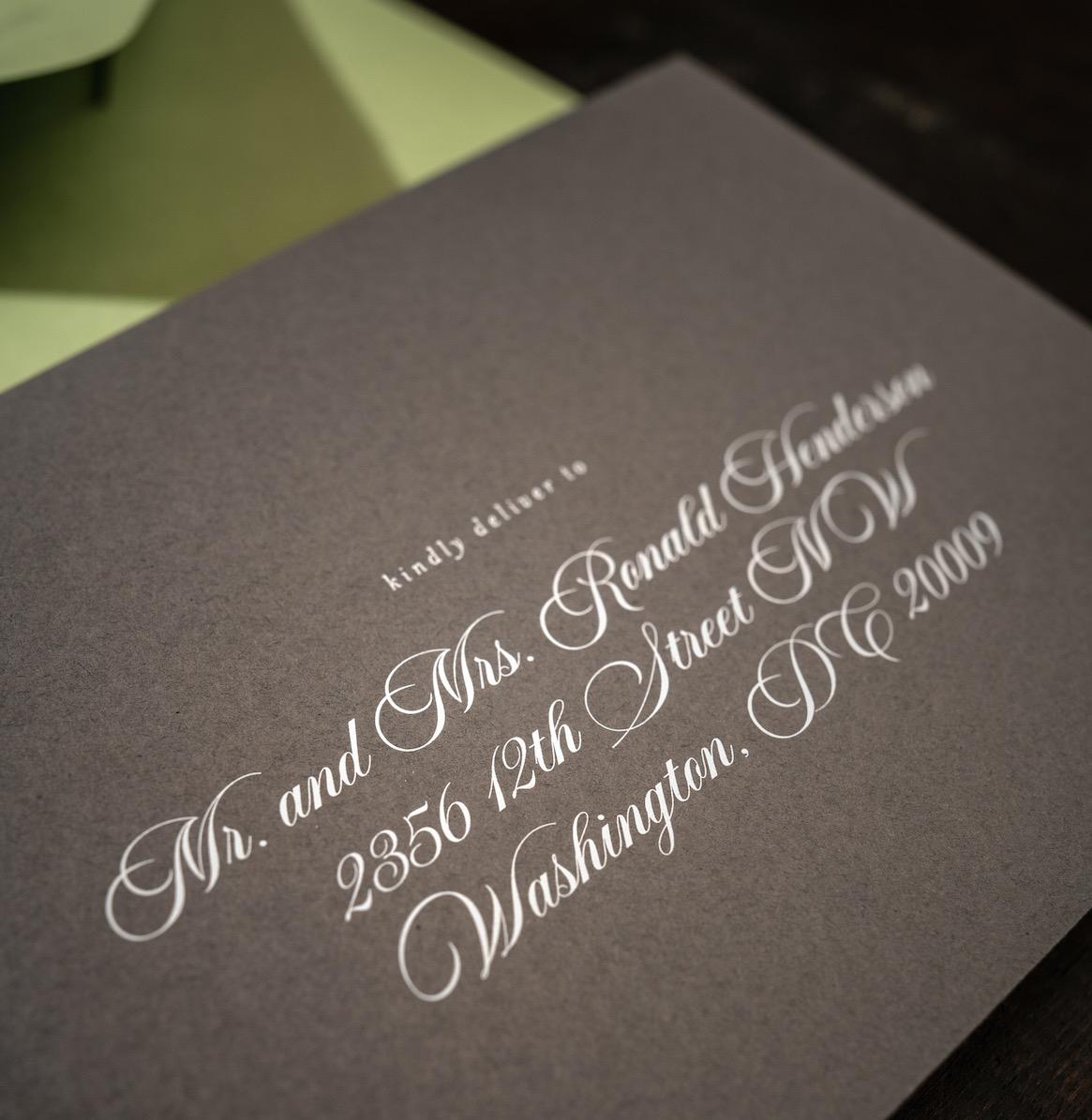
Letterpress printing is not a good solution for guest addressing envelopes (this goes back to the whole printing plate for each design element spiel). For guest addressing envelopes for weddings or events, we can digitally print your addresses from a mail merged spreadsheet. Dark envelopes? No problem! We have the capability to print white ink on dark paper.
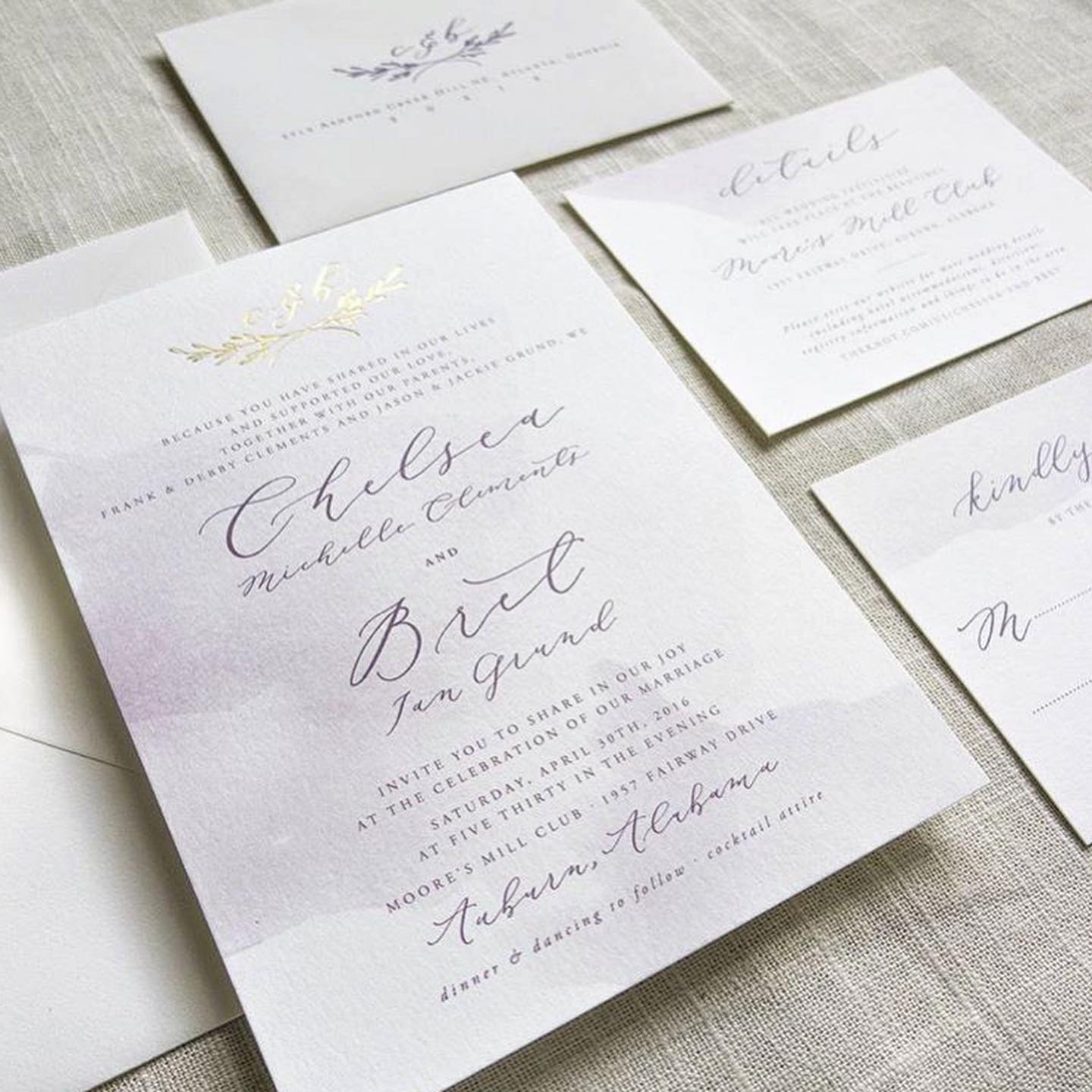
Digital + Letterpress
In our humble opinion, digital printing will never compare to it’s cool older sibling. However, we are willing to allow it under certain circumstances. If a design calls for it, we can provide a combination of letterpress + digital, such as a subtle watercolor wash, a photo, or multicolored logo, for example. Digital printing typically requires a specially coated paper, so this may limit color, weight, and texture options. We’ll give you all the details on a case by case basis.
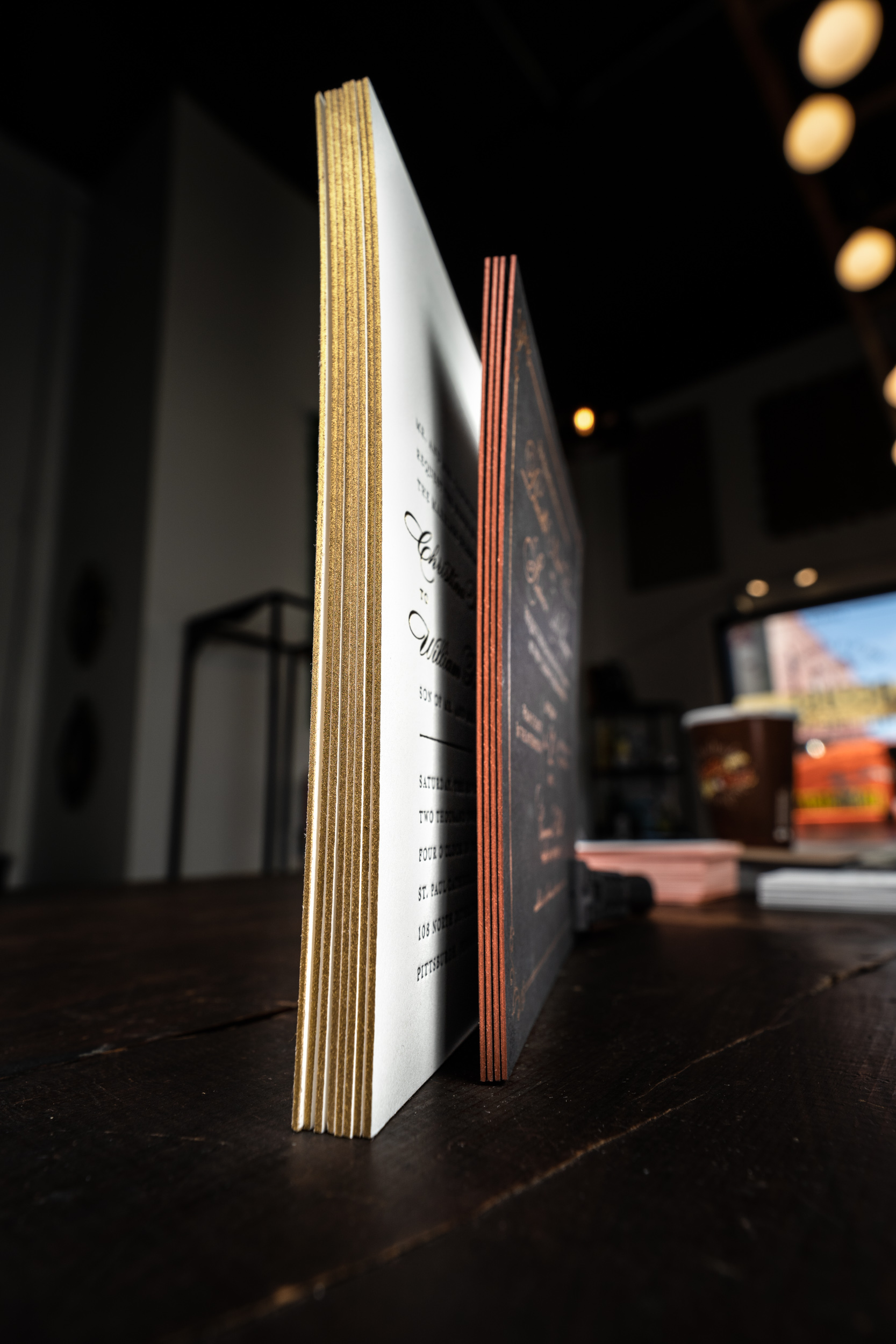
Choose a thicker-weight paper to help those beautiful painted edges stand out.
Edge Painting
Edge painting is another cool way to add a pop of color to a project. We usually recommend edge painting thicker-weight papers for maximum effect. We are able to edge paint colors matched to a Pantone number, or a selection of metallic colors such as gold or silver. Metallic colors will not look the same as foiled edges, but still, add a nice bit of flare.
Templates
Below you will find layout templates for our most popular products. Each zip file contains an .ai and .pdf template created in Adobe Illustrator CC. If you have any questions please do not hesitate to contact us.