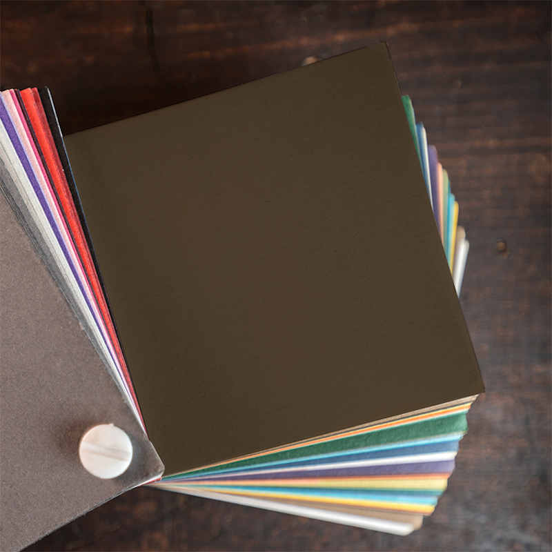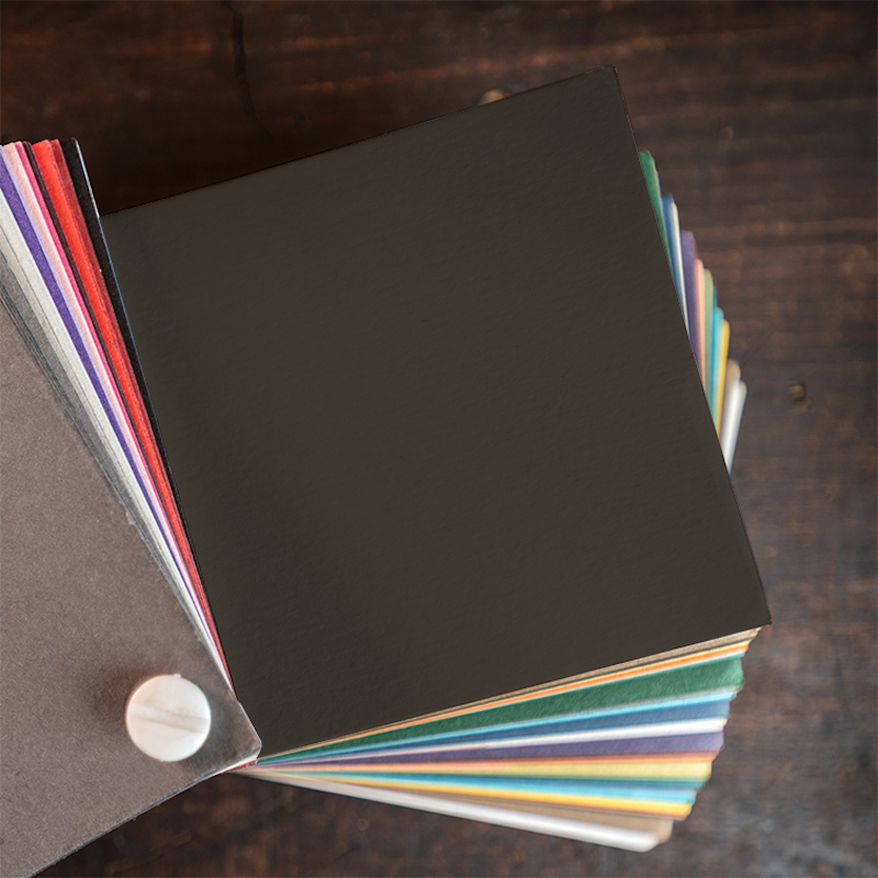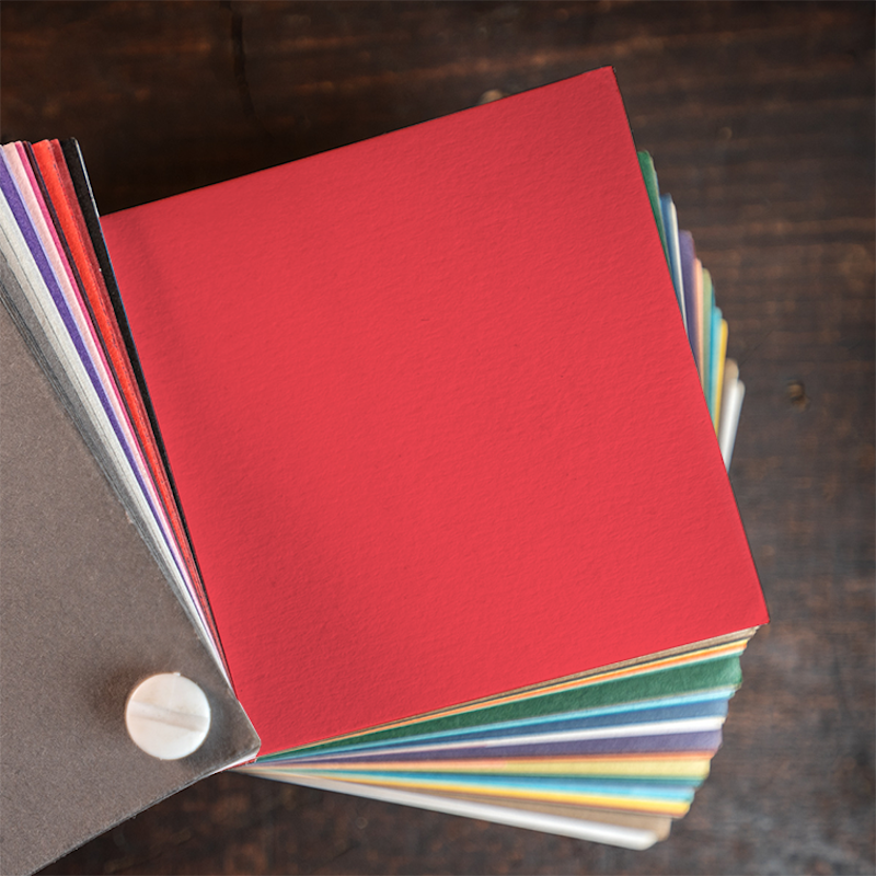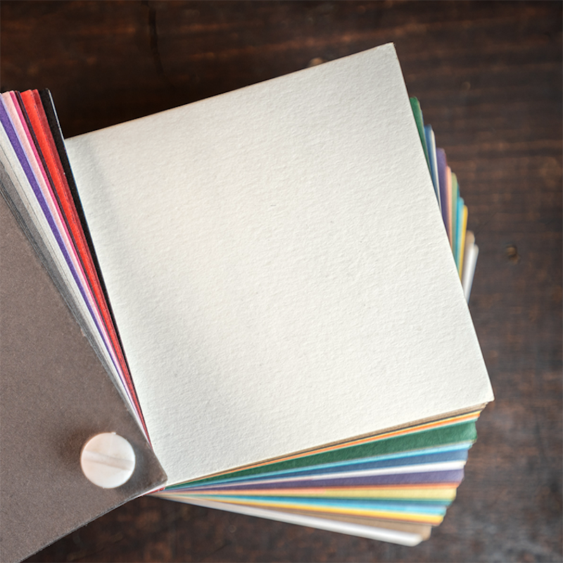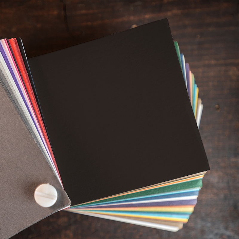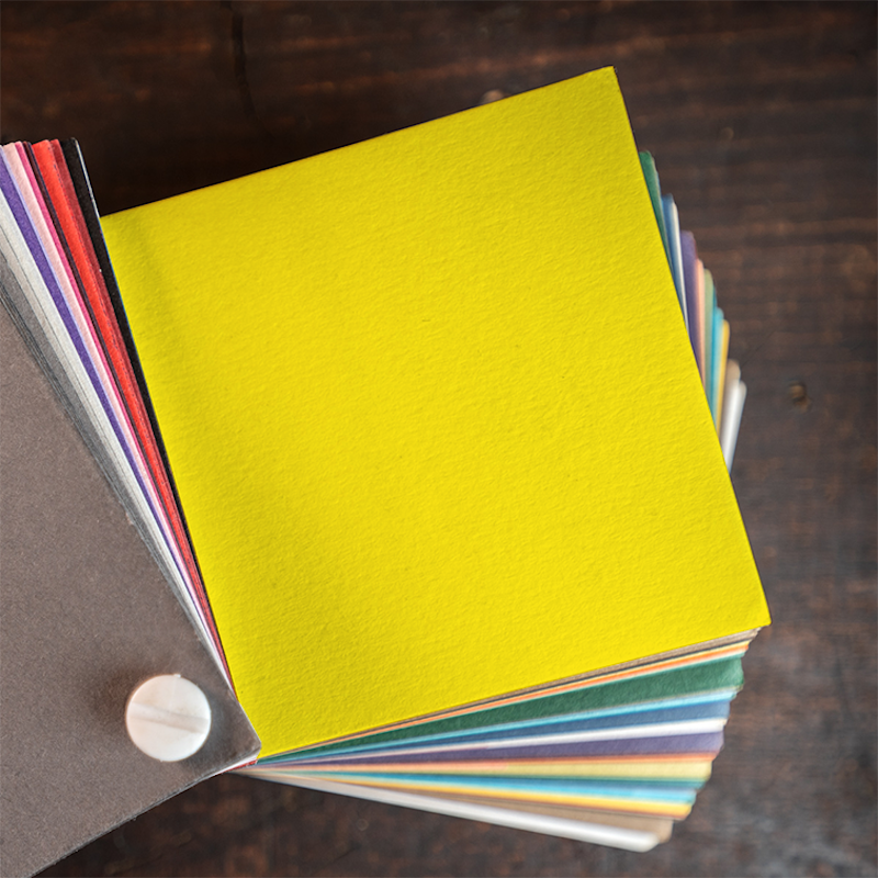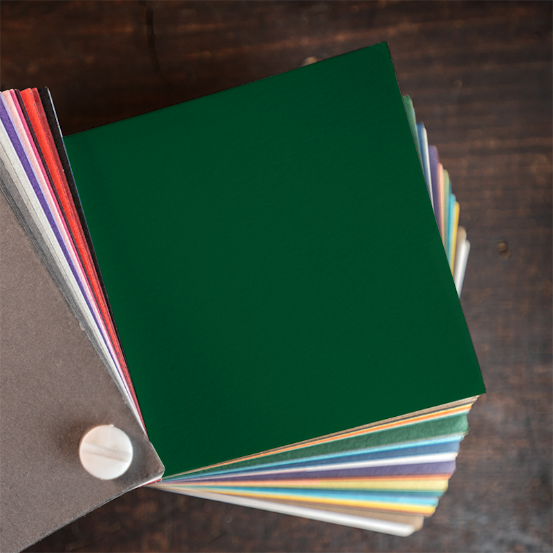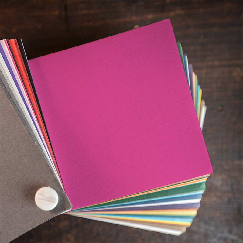
The Owl’s Nest Collection: Papers & Inks
When you’re as intentional as an Owl, over time you pick your favorites.
Intentionality is our favorite word around here. For us, it represents a beautiful alignment of choices all made to bring a client’s vision to life. We weren’t always experts at the letterpress game, but over the years we’ve taken risks and experimented and have come to understand the heart and soul of our presses, the process, and the inks and papers that make this passion add up.
We’ll always be fans of trying something new, but we’re also proud to say that we’ve honed this craft in such a way that we feel great about our curated collection of favorites. The Owl’s Nest Collection represents the papers and inks that rise to the top. We’ve seen these products produce gorgeous results and we stand behind the suppliers that keep us stocked.
Inks
So many colors, so many possibilities. We mix our inks the old-fashioned way, from scratch with a palette knife and a few base colors. We use the Pantone Matching System Solid Uncoated color book as a guide, and with nearly 2,000 colors, we’ve narrowed them down to some of our favorites to get you started.
-
Black
-
Warm Gray 11
-
PMS 431
-
Cool Gray 9
-
Warm Gray 3
-
Cool Gray 1
-
PMS 4745
-
PMS 7531
-
PMS 436
-
PMS 4625
-
PMS 7502
-
PMS 7516
-
PMS 451
-
PMS 5807
-
PMS 363
-
PMS 7742
-
PMS 5463
-
PMS 7736
-
PMS 387
-
PMS 328
-
PMS 326
-
PMS 633
-
PMS 5523
-
PMS 621
-
PMS 5665
-
PMS 5645
-
PMS 7697
-
PMS 5445
-
PMS 7457
-
PMS 642
-
PMS 551
-
PMS 3025
-
PMS 295
-
PMS 2623
-
PMS 5135
-
PMS 665
-
PMS 5225
-
PMS 227
-
PMS 7421
-
PMS 7640
-
PMS 7523
-
PMS 5025
-
PMS 691
-
PMS 218
-
PMS 226
-
PMS 185
-
PMS 1935
-
PMS 7625
-
PMS 198
-
PMS 1775
-
PMS 7415
-
PMS 719
-
PMS 472
-
PMS 7592
-
PMS 1595
-
PMS 1485
-
PMS 605
-
PMS 107
-
PMS 7499
Custom Colors
We can mix any color specified in the Pantone Solid Uncoated color book. We mix inks by eye per Pantone formulas and match to swatches at press under 6000K LED lighting. If you aren’t sure of the exact color you need, we can help you find the right one. While we strive for perfection, we can only guarantee to be within plus or minus one color shade.
Foil Colors
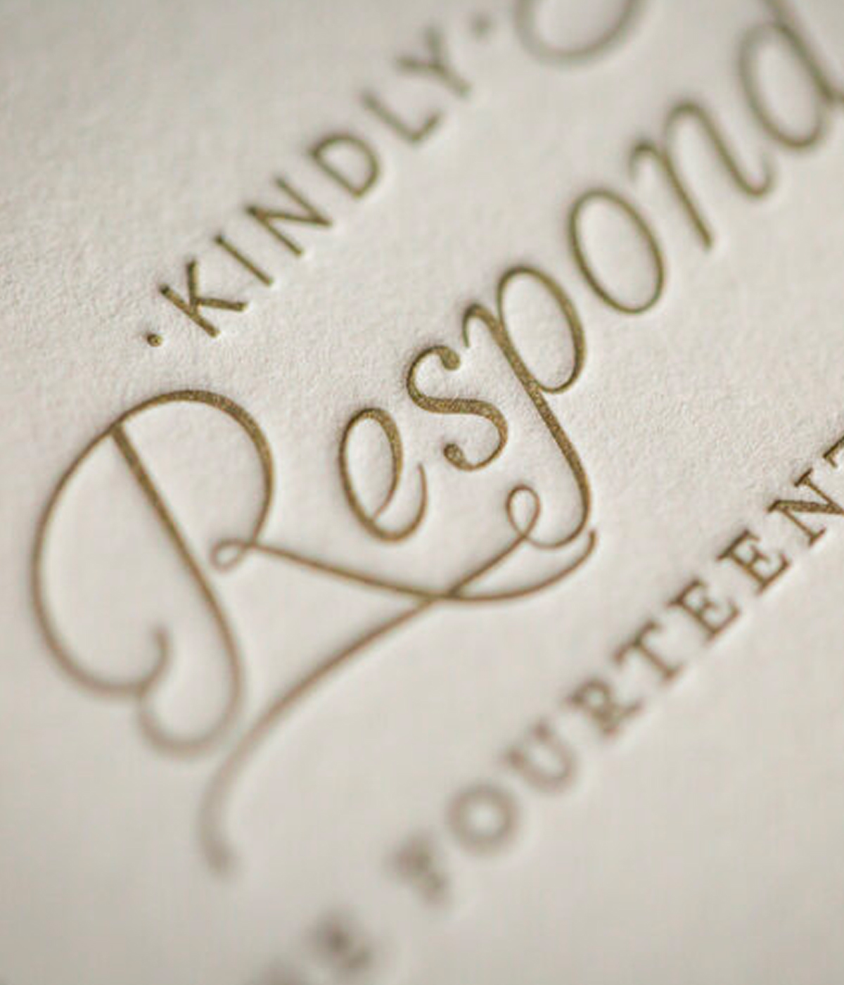
Bright, shiny things. We love them, too. The metallic effect that foil offers can be an excellent enhancement to your design. Foil can elevate the elegant or slay the sensational. Give it some thought. Your design will stand out from the ordinary. Who wants to be ordinary?
-
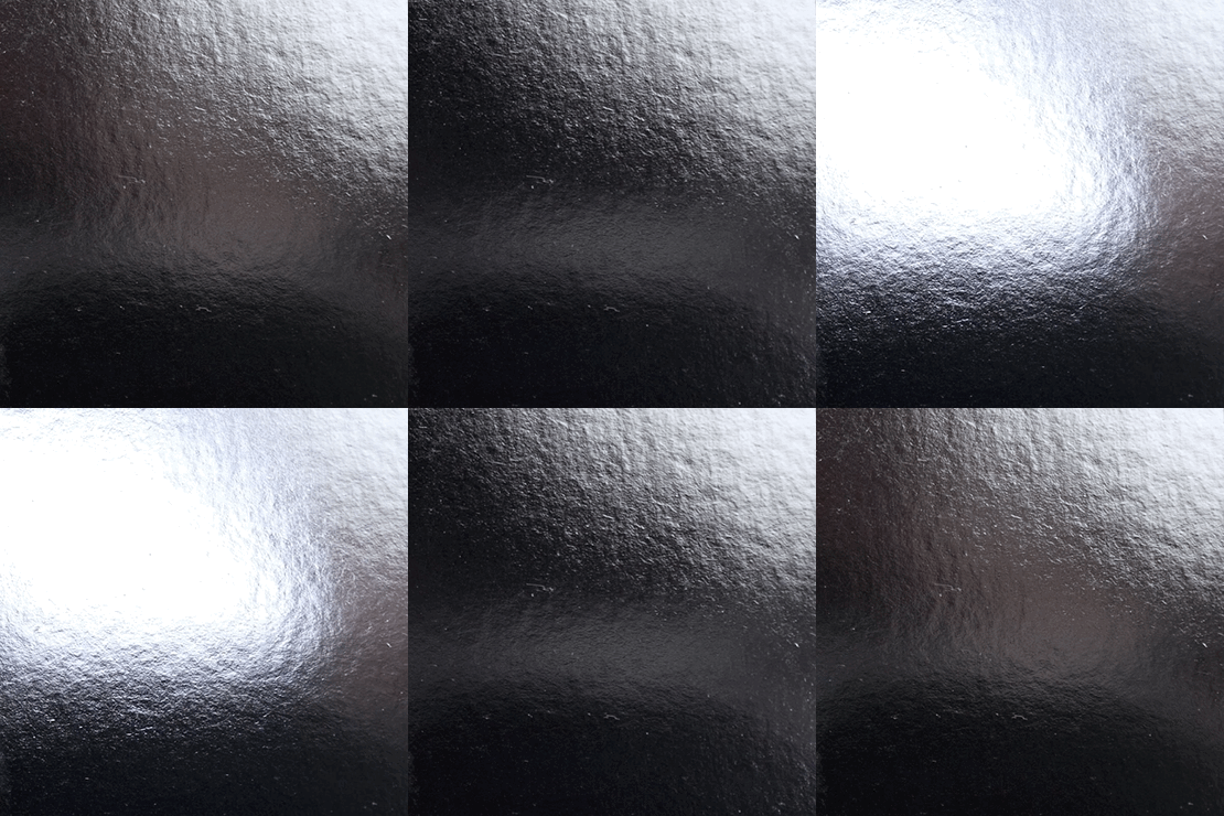
Bright Silver
-
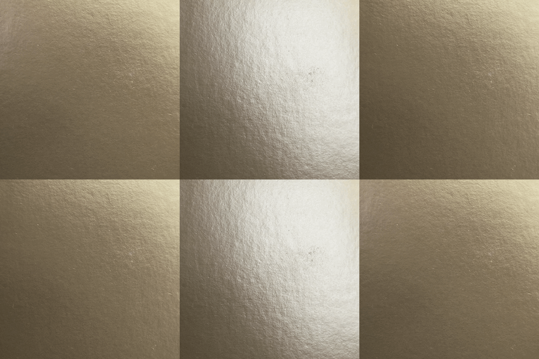
Matte Gold
-
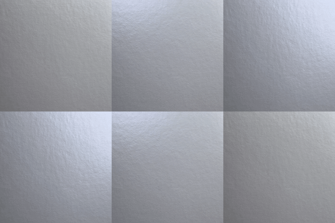
Matte Silver
-
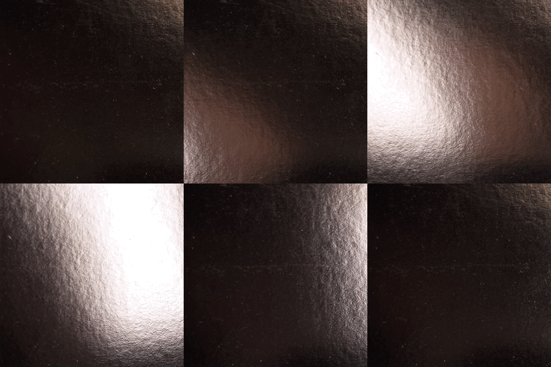
New Penny
-
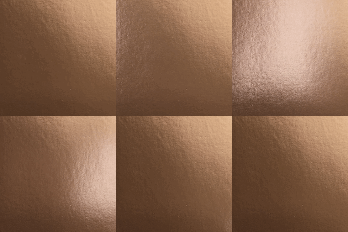
Pale Copper
-
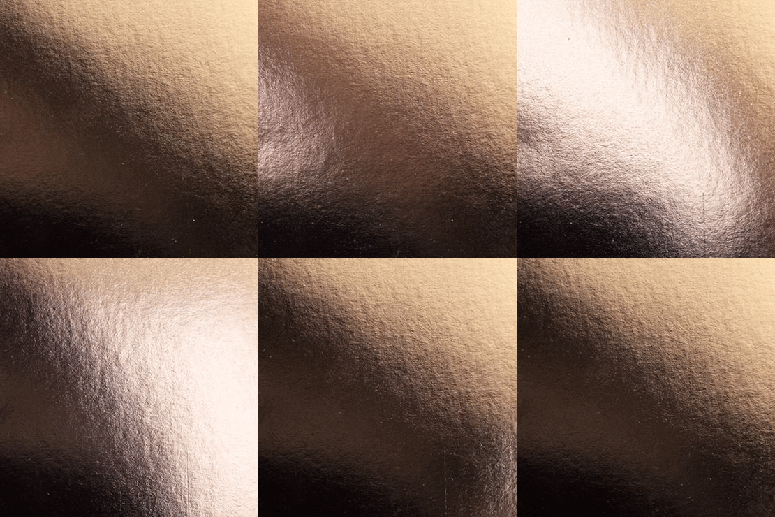
Dull Copper
-
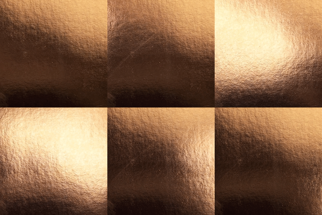
copper
-
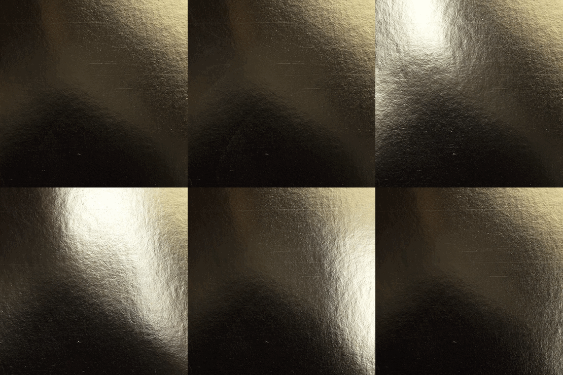
Bright Gold
-
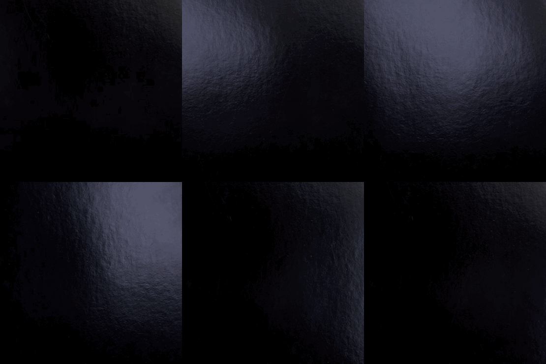
Black
-

White
Paper
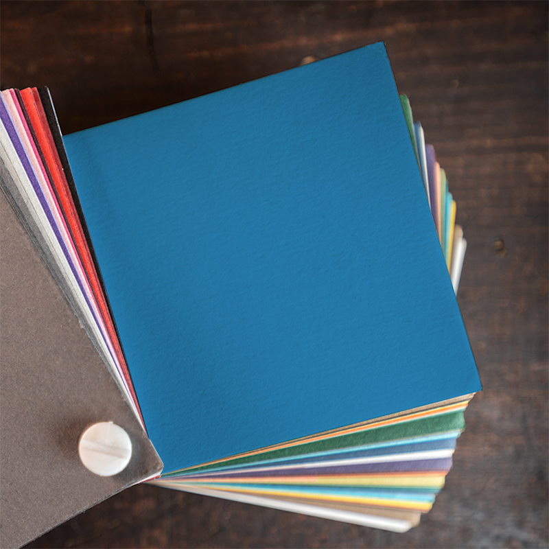
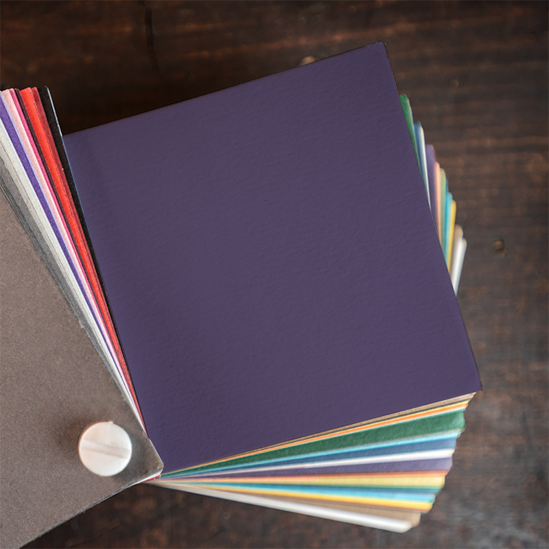
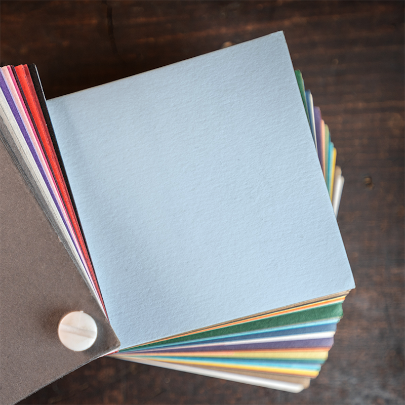
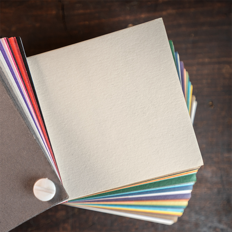
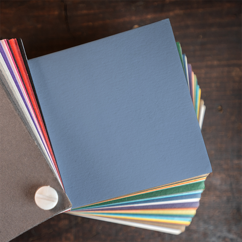
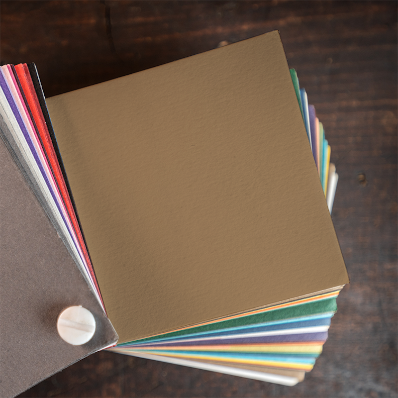
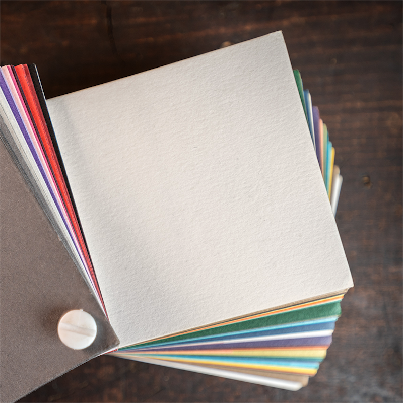
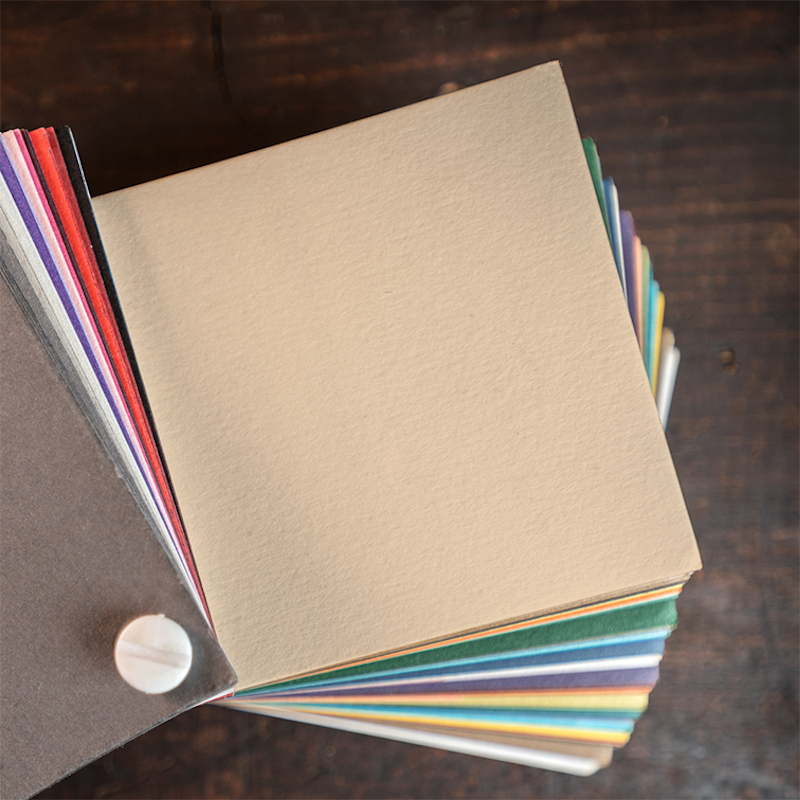
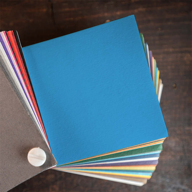
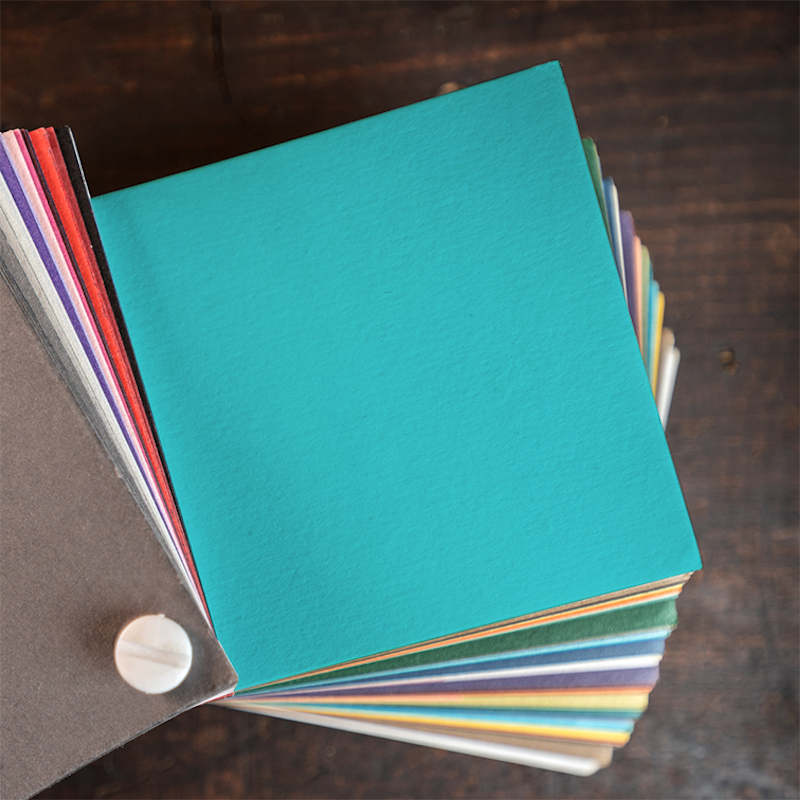
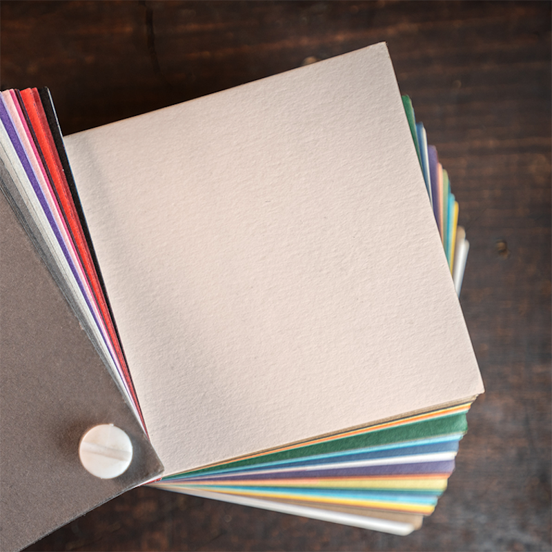
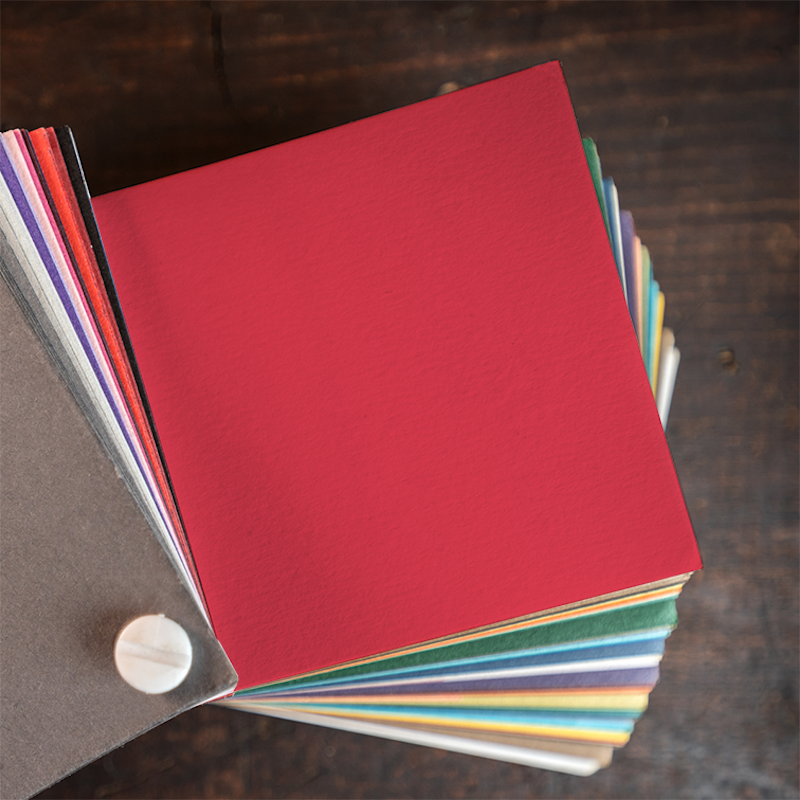
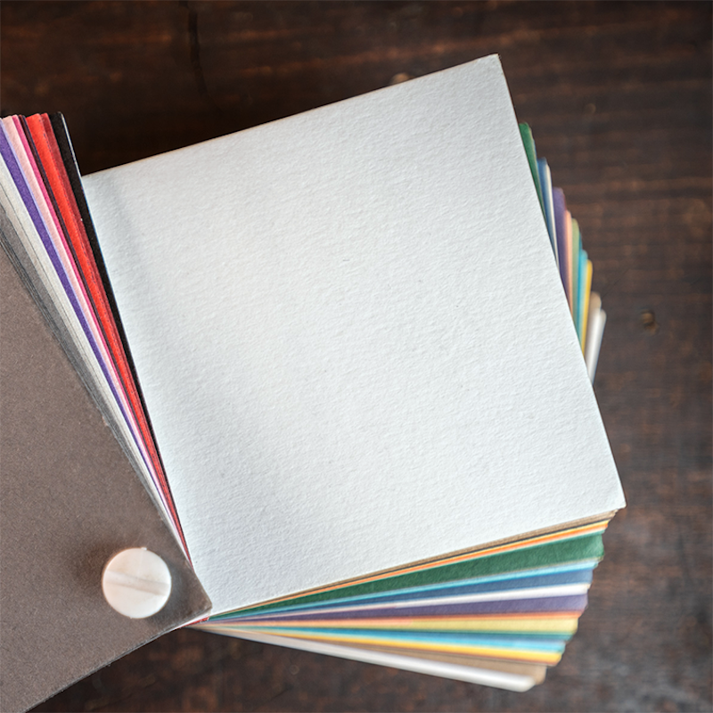
You’re never fully dressed without a smile, nor is your project without the right paper! It’s a big world out there, but we have narrowed down our favorite papers and want to show you why we love them and how they will help bring your project to life.
Crane's Lettra®
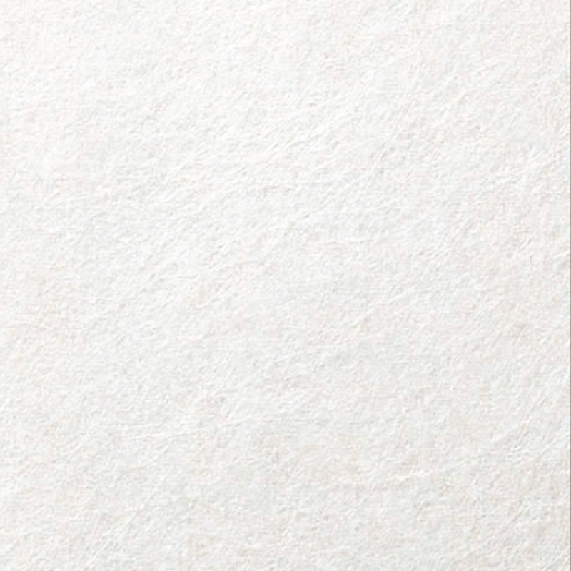
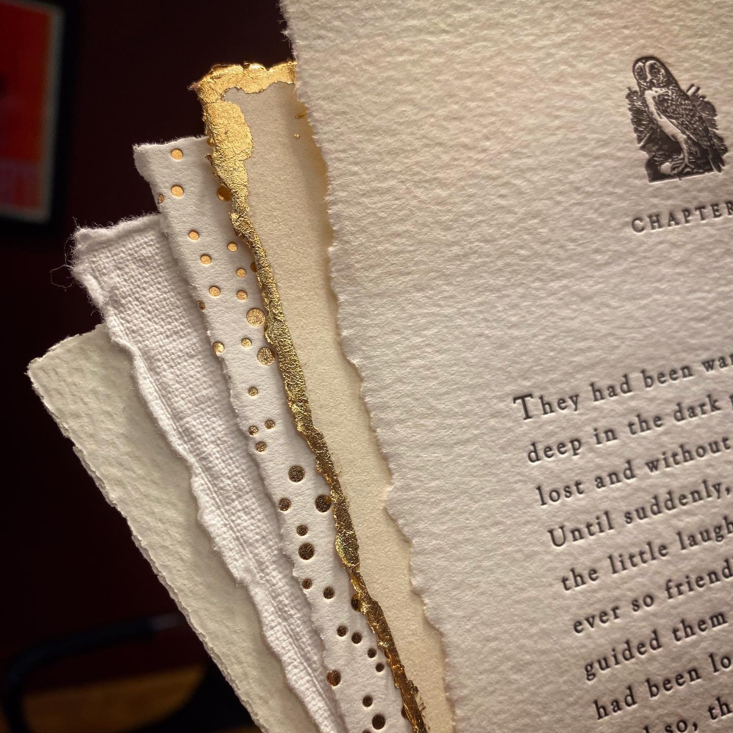
Tree-free is the way to be. Crane’s Lettra® is 100% cotton and is made for letterpress. It’s soft, fluffy, and thick which makes for a nice deep printing impression—the kind that screams letterpress from the top of the highest mountain. We love to use Lettra for wedding invitations, and other special event invitations because of its luxurious feel.
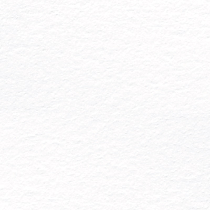
Fluorescent White
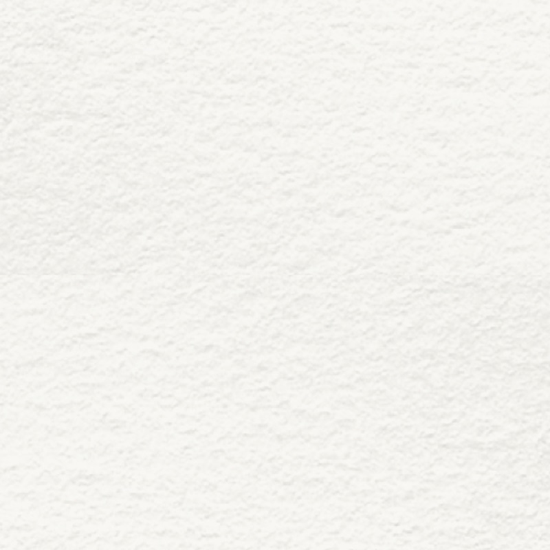
Pearl
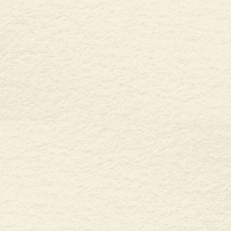
Ecru
Some notes about Lettra:
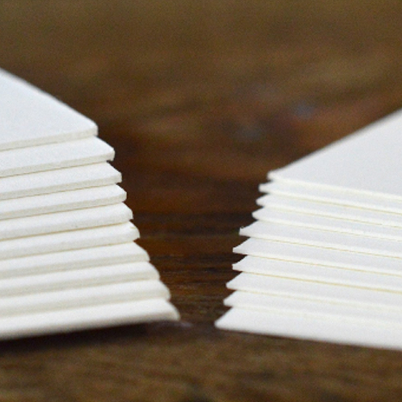
It comes in three colors: Fluorescent White (or flo-white if you're in a hurry) is the brightest white of the three. Pearl White is slightly off-white and our most popular choice. Ecru is a rich cream. Lettra does not have a smooth surface, which means that totally opaque color washes are not a guarantee. Think stone wash jeans, which, in some opinions, are never out of style. Lettra comes in two weights, 110lb and 220lb. When considering a two-sided project, we recommend sticking with 220lb or considering duplexing to allow for great impression on both sides. 220lb Cotton Lettra is pictured on the left and 110lb is on the right.
